3.2 Creating Pie Charts
Pie charts are a convenient way to visualize data if the categories that divide the data are not that numerous. Pie charts apply to categorical variables (either ordinal or nominal). In most cases pie charts are not appropriate for numerical variables since there usually are too many different numbers for that type of variable.
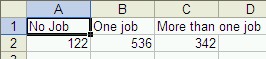
Example: Suppose a survey was done among 1000 adults about their job situations, with the following results:
No Job One Job More than one Job 122 536 342 Use a Pie chart to represent this data.
Instead of using a table - which may or may not look "pretty" we need to represent the data in a pie chart. We would proceed as follows:
- Start Microsoft Excel
- Enter the above data, using the first three columns and two rows of the spreadsheet. Your spreadsheet should look similar to this:
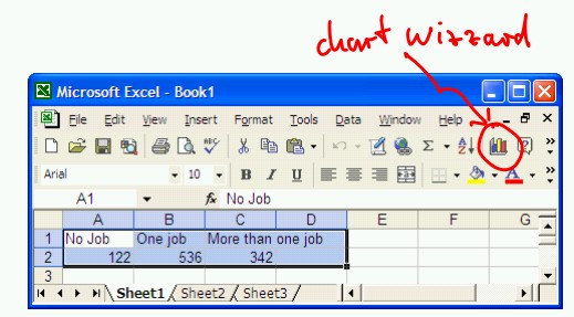
- Highlight the six cells containing the titles and numbers and click on the Chart Wizard tool (in Excel 2003):
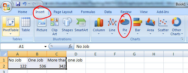
- In Excel 2007, use the "Insert" ribbon for the Pie chart wizard:
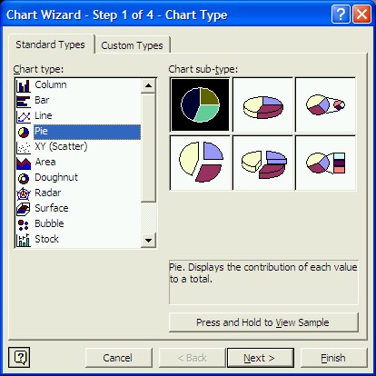
- In Excel 2003, the Chart Wizard will open, helping you to determine the configuration of your chart. In the first step, select "Pie" as Chart type, and the three-dimensional sub-type, as indicated in the picture below (please note that there are many other chart types available, including "Bar" and "Column" charts):
- Press "Next" twice, then enter a title for your chart. In our example, you might enter the title "Job Situation in Widget County", then press "Next" again.
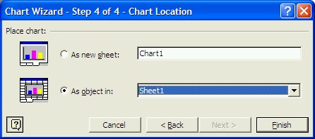
- Finally, you have the choice of placing the pie chart into a new sheet, or as a movable and sizable object inside the current sheet, entitled "Sheet1". Choose the latter one ("As object in ...") and click on "Finish".
- The final pie chart should look similar to the following:
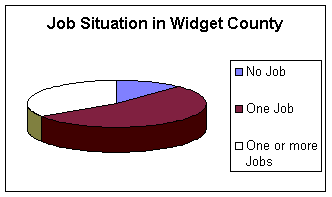
but it should be embedded inside your spreadsheet. You can move the chart around inside your spreadsheet and customize various components of your chart (colors, texts, etc.) by double-clicking on them inside Microsoft Excel - try it out now.
Of course, you can also print out the chart, whether embedded in your data sheet or created as a separate sheet.
Practice: If your pie chart does not have a 3D-look, what would you need to do to re-create the chart but this time with a 3D look?
Note: If you move your cursor over the various slices of the pie while inside Microsoft Excel, you will see the total number as well as the number in percent corresponding to that slice. In fact, when you double-click on the pie you can choose the "Data Labels" tab from the "Format Data Series" dialog box to include the numbers in a variety of formats in the graph - try it out now.