3.3 Creating Bar Charts
Bar charts are applicable to categorical variables, just as pie charts, but they can accommodate more categories than pie charts.
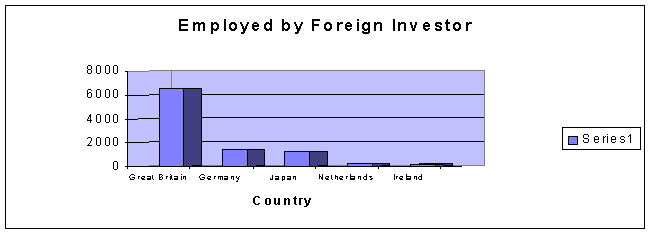
Example: A survey was done to find the number of workers employed by major foreign investors.
Great Britain Germany Japan Netherlands Ireland 6500 1450 1200 200 138
Construct a bar char representing this data.
This time we need to represent the data as a bar chart, with vertical bars, or columns, representing the number of workers employed by major foreign investors (in some unit of measurement):
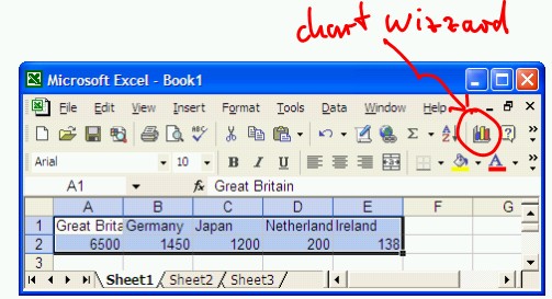
- Start Microsoft Excel
- Enter the above data, using the first five columns and two rows of the spreadsheet. Do not worry about the fact that you may not be able to see the entire country names in the first row.
- Highlight the ten cells containing the titles and numbers and click on the Chart Wizard tool (in Excel 2007 you can generate bar charts using the "Insert" ribbon):
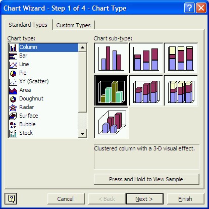
- The Chat Wizard will open, helping you to determine the configuration of your chart. In the first step, select "Column" as Chart type, and the three-dimensional sub-type as indicated in the picture below (please note that there are many other chart types available, including "Bar" and "Pie" charts):
- Press "Next" twice, then enter a title for your chart. In our example, you might enter the chart title "Employed by Foreign Investor" and the category (X) axis title as "Country", then press "Next" again.
- As in the previous pie chart, you have the choice of placing the pie chart into a new sheet, or as a movable and sizable object inside the current sheet, entitled "Sheet1". Choose the latter one ("As object in ...") and click on "Finish".
The (almost) final bar chart should look similar to the following:
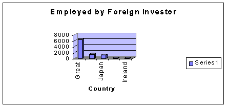
but it should be embedded inside your spreadsheet. You can again customize the various components of your chart (colors, texts, etc. by double-clicking on them inside Microsoft Excel. In our case, you should notice that not all country label are present in the chart (only "Great" - for Great Britain, "Japan", and "Ireland" are visible). To rectify that, double-click carefully on any of the country names. You should see a dialog box entitled "Format Axis" that allows you to modify the appearance of the labels along the x-axis. Choose a smaller font size to finally obtain a bar char similar to the following (you may also have to resize the chart by dragging one of its corners inside Excel to make sure all labels will fit along the x-axis):