4.7 Descriptive Statistics in Excel
Excel provides a convenient tool to compute many of the most commonly used descriptive statistics such as mean, mode, median, variance, and standard deviation all at once.
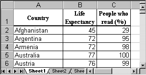
Example: The following Excel spreadsheet contains some data about life expectancy and literacy rates in about 100 countries of the world in 1995. Compute the mean, mode, median, variance, standard deviation, and range of the two variables.
First, as usual, we need to load the data into Excel. The spreadsheet should look similar to the following:
To compute a variety of descriptive statistics all in one swoop, we proceed as follows:
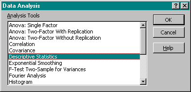
- Select "Data Analysis ..." from the "Tools" menu entry and select "Descriptive Statistics":
- Enter the Input Range for the data, i.e. place the mouse over column B, click and hold the mouse button, then drag the mouse over column C as well. Both columns B and C should now be selected. Make sure there is a checkmark next to "Summary Statistics" in the "Output Options".
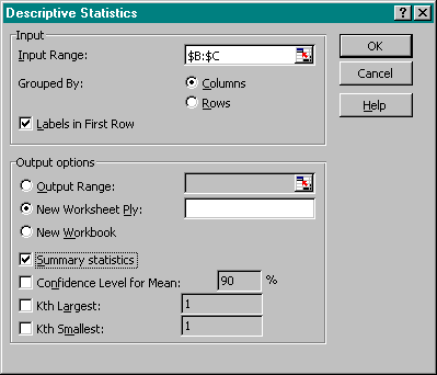
Make sure that you also check the box "Labels in First Row", then click on "OK".
- After clicking on "OK", Excel will compute a variety of descriptive statistics all at once and display them in a new worksheet, as follows:
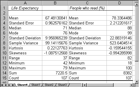
We can see, for example, that for the average "Life Expectancy" we have computed the mean to be 67.48, the median to be 71, and the mode to be 76. The standard deviation is 9.96, the variance is 99.14 and the range is 37.
These descriptive statistics computed by Excel are familiar, and Excel computes a number of additional values such as range, minimum, etc., that are self-explanatory except for "Kurtosis" and "Skewness". We will ignore Kurtosis, but we actually know how to interpret skewness:
- If the skewness is negative, the histogram (distribution) for the data is skewed to the left
- If the skewness is positive, the histogram (distribution) for the data is skewed to the right
- If the skewness is approximately zero, the histogram (distribution) for the data is symmetric and usually normal
Example: Compute the descriptive statistics for the data set
that we analyzed in the previous section about box plots and skewed distributions, and compare the skewness coefficient with the results of your analysis in the previous section.
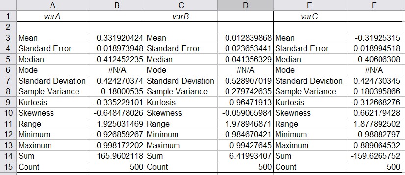
Loading that data set into Excel and running the "Descriptive Statistics" for all three columns simultaneously yields:
- You can see that "varA" has a negative skewness of -0.65. Thus, the histogram for varA should be skewed to the left, and the mean should be smaller than the median. Thus, the first box plot in our previous analysis corresponds to varA.
- "varB" has a skewness close to zero so that its distribution should be normal and mean and median should be similar. Thus, the third box plot from the example in the previous section corresponds to varB.
- "varC" has a positive skewness so the distribution would be skewed to the right and the mean should be greater than the median. Therefore the second box plot from our earlier example describes varC.
