Construction of Graphs
In studying a biological phenomenon the observer customarily collects
data ("datum" is singular, "data" is plural) about the phenomenon.
It is usually necessary, or at the least convenient, to organize those
data into some form that can be more easily displayed, more readily understood,
and more effectively communicated to other people. An organized body of
data (or information) usually takes the form of a table or a graph.
These serve to summarize information as well as organize information and,
at the same time, simplify the information in comparison to the body of
raw data.
Beyond these obvious advantages, tables and graphs also may reveal features
about the data that were not apparent from the body of raw data. That is,
the organized, summarized, simplified data format of a table or graph makes
it more likely we will notice patterns, trends, differences, changes, or
relationships in the data. Tables display information in neat rows and
columns, which simplifies side-by-side comparisons. Graphs are especially
useful in revealing comparisons because they show at a glance where a curve
rises and falls, where (and by how much) one curve differs from another,
how much a change in one variable affects another variable, and so on.
Keep in mind that a given body of data may be presented as a table or
as a graph. In some cases one format is better than the other.
Graphs may take a variety of forms, depending on the information that
one wants to organize and communicate. That is, there is no single graph
format or "all purpose" graph. Yet there are rules to follow in preparing
graphs so that the graphs are effective. Just as one can't communicate
effectively in writing if spelling and grammar are poor, graphs will fail
to communicate if some basic guidelines aren't observed in preparing the
graphs. If this means nothing else, it does mean that failure to learn
how to construct and read graphs will lower your grades here, in other
courses, on the GRE and MCAT, and so on.
The primary consideration is that the graph gives accurate information
in a clear manner. That means it must be organized, drawn, and labeled
in such a way that misunderstanding and confusion are avoided. So, as nearly
as possible the graph should be constructed such that it could "stand alone,"
with its message clearly understandable to the reader by studying the drawing
itself plus the labels, title, and legend. Though several of these "rules"
may seem like common sense, they are often overlooked when students try
to organize their own lab data into graphs.
1. Keep it simple as much as possible, but don't sacrifice accuracy
or clarity for the sake of simplicity.
2. Plot the data points accurately. As obvious as that seems, misplotting
of points is a common error. The location of data points on a graph determines
where the curve is drawn. If the points are misplotted, then the curve
is misdrawn. And the curve will mislead anyone who tries to extract information
from it later.
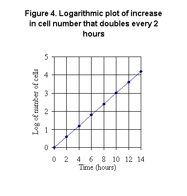
3. Label the axes as clearly and simply as possible. This means to identify
the variables (time, height, speed, wavelength, etc.) and the units
of measurement for those variables on the axes. In Figure 1 shown here
the variable on the x-axis is walking speed, and the units
are miles per hour. There are other units possible (feet/second, meters/minute,
km/hour, e.g.), so the graph must tell the reader.
4. Put the independent variable on the abscissa (x-axis) and
the dependent variable on the ordinate (y-axis). The dependent variable
(as its name implies) is the one whose value depends on the value of the
other variable (independent variable). The y-value depends on the x-value,
not the other way around. Figure 1 shows at a glance that if you walk faster,
you use more calories per hour.
5. Always mark the exact location of the divisions on both axes; use
tick marks. In Figure 1 here the y-axis is clearly marked, but the x-axis
is not. Where exactly is 2 mph on the x-axis? Where is 1 mph? If you're
asked to use this graph to determine how fast to walk in order to burn
300 calories per hour, that's hard to do accurately without clear markings
on the x-axis.
6. Related to #5 above, select uniform divisions on the axes.
In Figure 1 here all of the y-axis divisions are 100 units
per division, i.e. they are uniform.
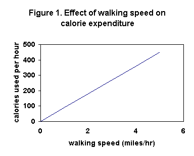
7. On both axes select divisions for the intervals that are easy to
work with. Remember that taking information from a graph often requires
interpolation (estimating values between two marked points). In Figure
2 here, the x-axis has been properly marked now, but the y-axis has divisions
that will make it hard to estimate values between those divisions (that's
interpolation). For example, how many calories per hour will you use if
you walk at 2.5 mph? Draw a line from 2.5 mph on the x-axis up to the curve
and then a line across to the y-axis? Determining that value would be easier
if the y-axis divisions were 100 each as in Figure 1 rather than 125 each
as in Figure 2. Again, choose your axis divisions with this point in
mind.
8. Though it won't be required in this course, it is often helpful to
"box-in" the entire graph by drawing another x-axis at the top and another
y-axis at the right side, along with the marked divisions. This improves
accuracy when data must be read from the graph by following horizontal
and vertical lines from the marked axes to the curve(s) drawn on the graph.
9. If you're going to draw two or more curves on the same set of axes,
be sure to clearly distinguish them from each other by using different
symbols to mark points (closed/open circles, squares, triangles, e.g.)
and/or different types of lines (heavy solid, light solid, broken, dotted,
e.g.). This is especially important, for clarity, where curves cross each
other or lie close together. The meanings of such symbolism must be given
in a legend or as labels on the curves themselves if that
is possible without cluttering the graph.
10. Avoid compressing or stretching either axis too much, unless there
is a good reason for doing that. For example, if the y-axis in Figure 2
here were made shorter, compressing the curve downward, there would be
more likelihood of error in reading from the y-axis to the curve.
11. Though not a strict rule, a graph should have a title. That,
along with the legend, scale markings, and axis labels, helps the reader
to understand the meaning of the graph without need to refer to a text.
Figure 1 here, for instance, has a title; but since it's a very simple
graph (only one curve on it), no legend is needed. If a title would help
to explain the graph, then include one.
12. In the two figures shown above, both axes have linear scales,
that is, the spacings between divisions are equal. However, in some cases
logarithmic scales are either needed or advantageous. Look at the
data in the following table. In this example you see the increase in the
number of bacterial cells in a population under study in a lab. The cells
of this species divide every hour, each cell giving rise to two cells in
its place; i.e. the doubling time is 1 hour.
|
Time (hours)
|
Number of cells
|
log10 of number of cells
|
|
0
|
1
|
0
|
|
2
|
4
|
0.60
|
|
4
|
16
|
1.20
|
|
6
|
64
|
1.81
|
|
8
|
256
|
2.41
|
|
10
|
1024
|
3.01
|
|
12
|
4096
|
3.61
|
|
14
|
16,384
|
4.21
|
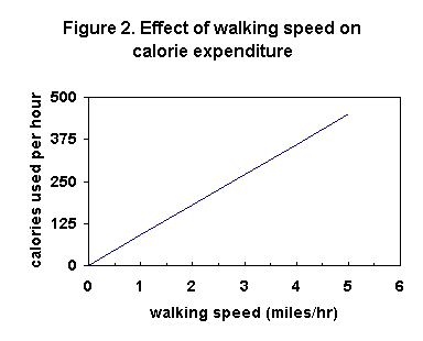
The data are plotted on linear axes in Figure 3. [This graph adds horizontal
and vertical lines at the tick marks, which improves reading values from
the graph.] Note that the y-axis label tells you that each data value has
been divided by 1000 before plotting it; so, the tick mark labeled
10, for example, actually represents 10,000 cells. This device is necessary
to get the very large values on the graph.
Unfortunately, that squeezes the smaller values together at the bottom
of the graph, making it impossible to accurately read numbers from the
curve. How many cells are there at 5 hours, for example? That cannot possibly
be read accurately from the y-axis of this graph.
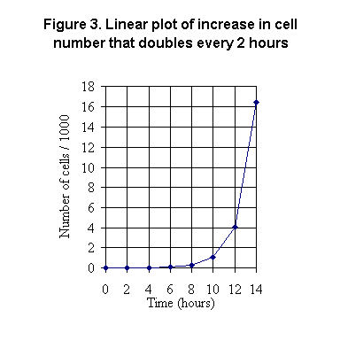
An alternative is to make the scale on the y-axis logarithmic,
as shown in Figure 4. Then each major division on the y-axis represents
a power of 10. The tick mark labeled "1" on the y-axis equals 10 cells;
the tick mark labeled "2" equals 100 cells. The tick mark labeled "3" equals
1000 cells and the tick mark labeled "4" equals 10,000 cells.
The use of common log scales as shown here in Figure 4 for plotting
such data that cover a very large range also has the advantage of producing
a straight line. That improves ease of reading data from the curve,
moreso that when the curve has a shape such as in Figure 3.